Prince George's County Demographics and Transit
d.w.rowlands [at] gmail.com
As part of an ongoing project for Prince George's Advocates for Community-Based Transit, I am collecting and presenting data about the current state of transit ridership and transit services in Prince George's County, Maryland. Our eventual goal is to propose service improvements for public transit in the county. However, we first need to develop a better understanding of the current situation. Below, I present four maps based on 2014 Census workforce survey data that illustrate demographic data about the County.
Place Names in Prince George's County, Maryland
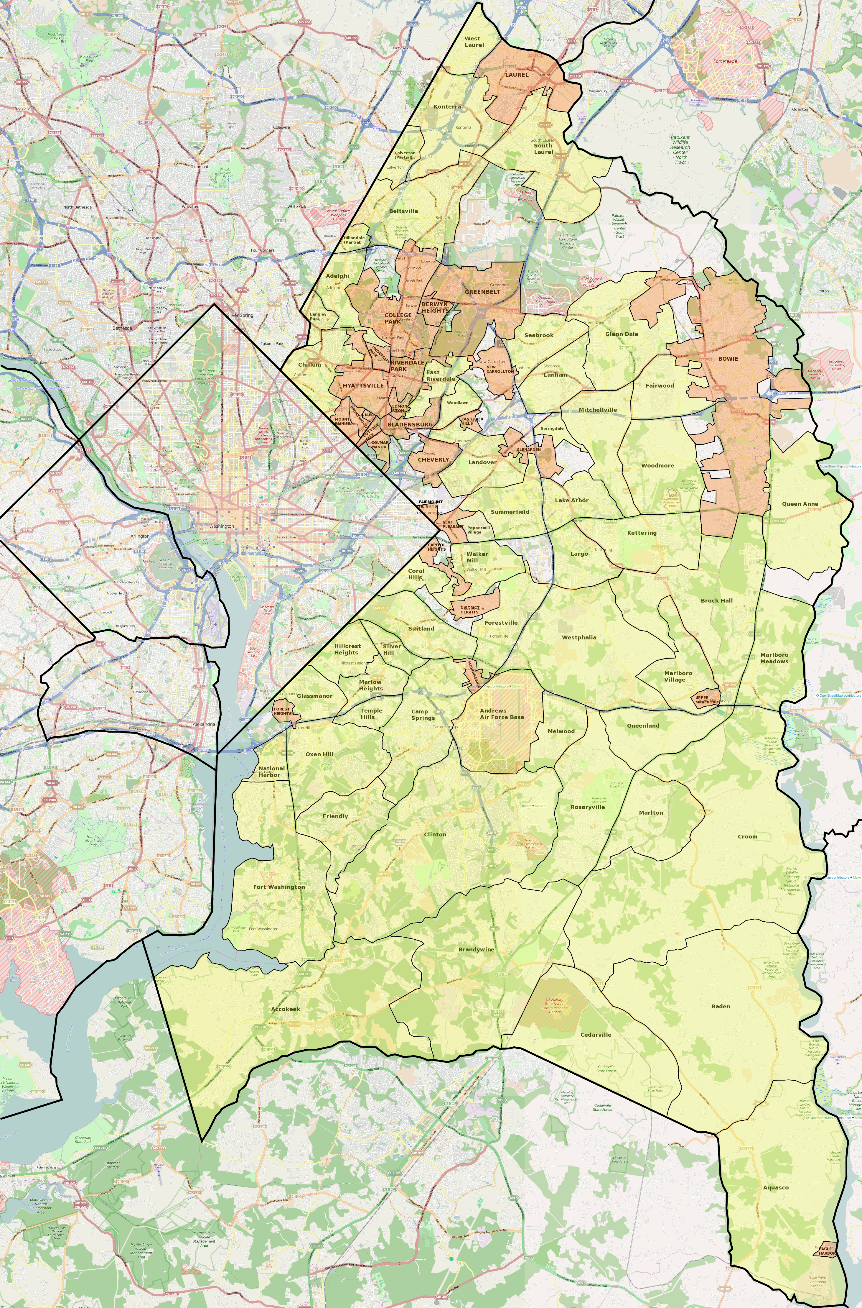
Click for a full-sized version.
Before discussing the demographics of localities in the County, it seems important to discuss place names, as well as which localities are incorporated municipalities and which are unincorporated Census-designated places with no legal existence or local government.
Like most counties in Maryland, Prince George's County consists mostly of unincorporated locations: only 27% of the county's 860,000 people live in incorporated cities and towns. (There is no legal distinction between cities and towns in Maryland.) While transportation is provided County-wide by WMATA (Metro) and the County's The Bus network, the presence of municipal governments in the northern and particularly northwestern section of the county gives these areas more responsive local government and, in many cases, better-organized civic organizations.
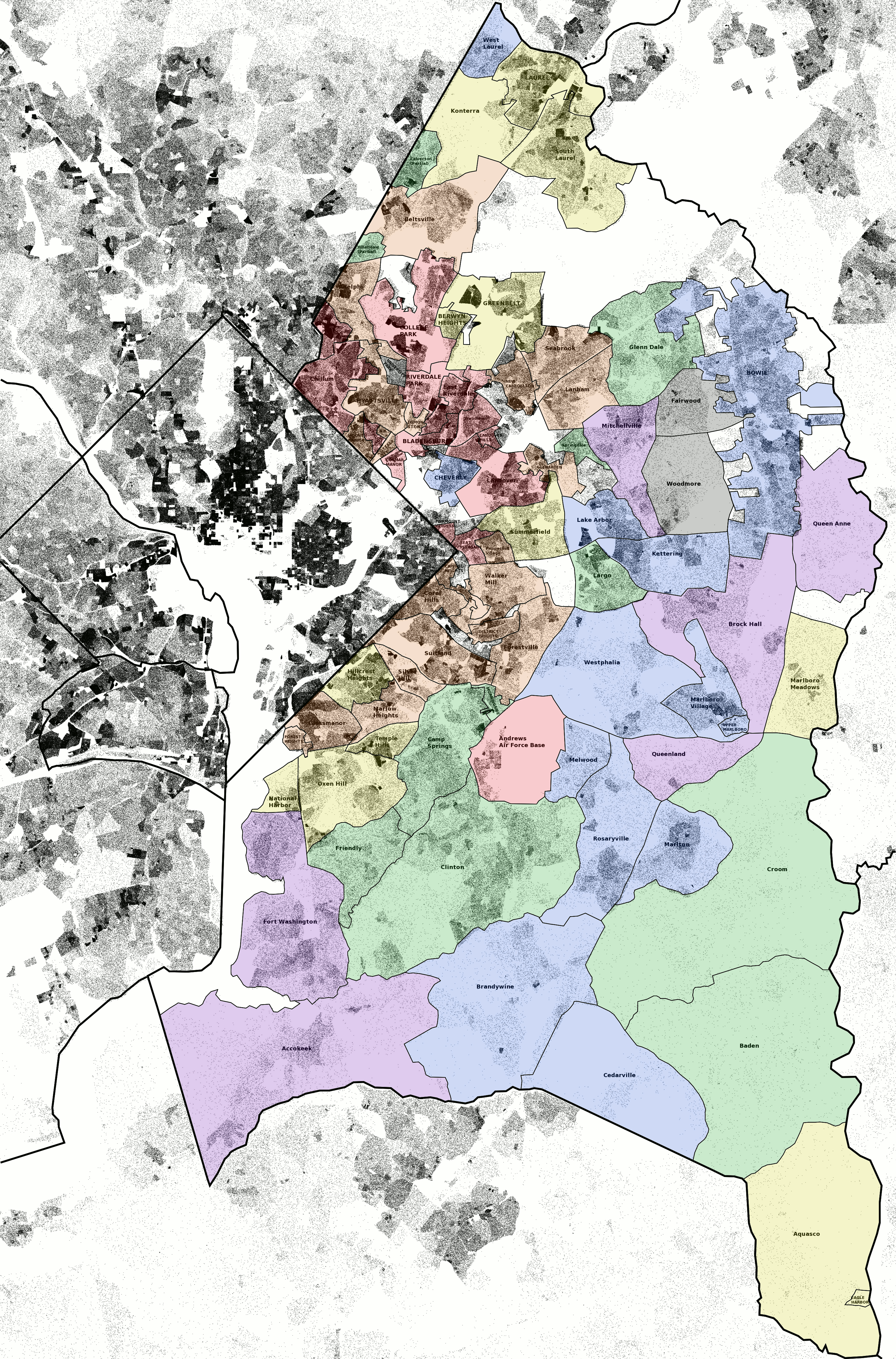
Transit Ridership in Prince George's County, Maryland

Click for a full-sized version.
Prince George's County has a distinct reputation for being less transit-friendly and more car-dependent than the rest of DC's inner suburbs. This reputation is not entirely undeserved; only one of of the fourteen Metrorail stations in the County has significant transit-oriented development, and new development in the County is still largely in car-dependent areas. However, as this map shows, there is significant transit ridership in the parts of the County inside the Beltway, including some, such as Mt. Rainier, Brentwood, and Bladensburg with no rail stations but good connectivity. In many of the areas bordering the District, the fraction of the population that commutes to work by walking and transit is one third or higher! This is true even in some of the southern suburbs that lack the Route 1 communities' history as streetcar suburbs.
The above map shows the fraction of the population that commutes to work by walking or transit according to 2014 Census data for each municipality and Census-designated place in the County color-coded according to the following table. It should be noted that College Park is an outlier due to the University of Maryland: other than College Park, the fraction of the population that commutes by walking is no greater than two percent anywhere.
| % Transit and Walking Commuters | Color |
| 0.0% - 4.9% | Black |
| 5.0% - 9.9% | Violet |
| 10.0% - 14.9% | Blue |
| 15.0% - 19.9% | Green |
| 20.0% - 24.9% | Yellow |
| 25.0% - 29.9% | Orange |
| > 29.9% | Red |
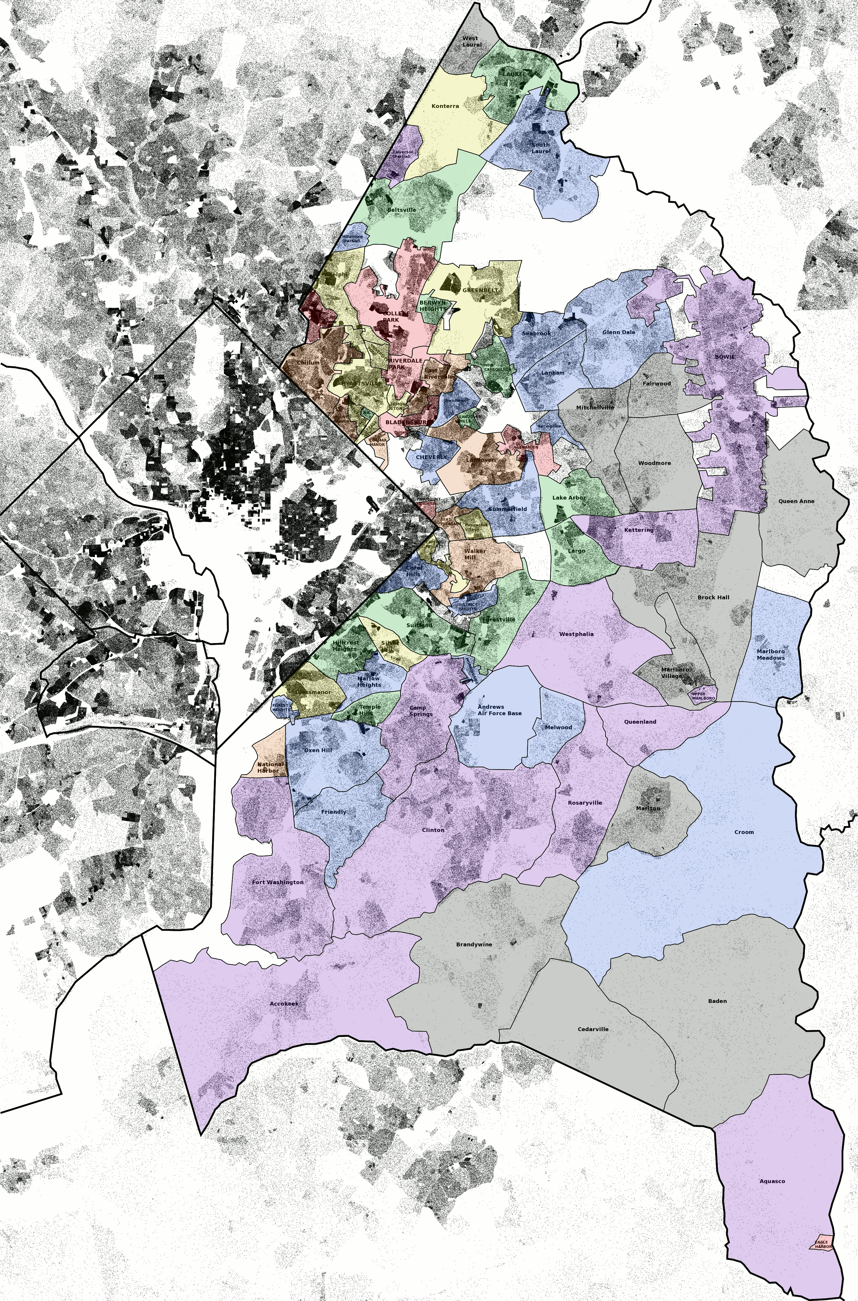
Income in Prince George's County, Maryland
Click for a full-sized version.
Income is often inversely correlated with transit ridership, particularly in car-dependent suburban areas. Virtually all of the development in Prince George's County was either built around an assumption of universal car ownership, or has been adapted to that assumption. As a result, it seems particularly likely that transit ridership will be most common in the parts of the county where people are least able to afford car ownership.
To explore this possibility, I made the above map, with municipalities and Census-designated places color coded according to 2014 Census data on per-capita income, including benefits.
| Per-Capita Income | Color |
| > $49.9k | Black |
| $45.0k - $49.9k | Violet |
| $40.0k - $44.9k | Blue |
| $35.0k - $39.9k | Green |
| $30.0k - $34.9k | Yellow |
| $25.0k - $29.9k | Orange |
| < $25.0k | Red |
Poverty in Prince George's County, Maryland
Click for a full-sized version.
Since per-capita income is an average that tells us nothing about income distribution, and since averages can be dragged up by a small population that has a much higher income than the majority of the population, I thought that it would also be useful to graph 2014 Census data on the fraction of the population below the poverty line. This map is color-coded based on the below table.
| % of Population in Poverty | Color |
| 0.0% - 2.9% | Black |
| 3.0% - 5.9% | Violet |
| 6.0% - 8.9% | Blue |
| 9.0% - 11.9% | Green |
| 12.0% - 14.9% | Yellow |
| 15.0% - 17.9% | Orange |
| > 17.9% | Red |